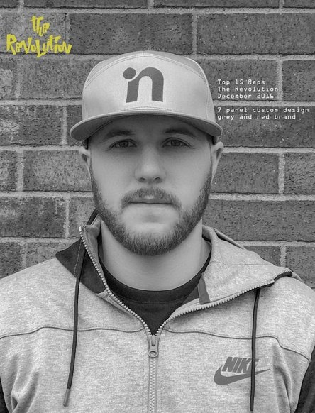
This was a project I did for work marketing an incentive we did. I used frequency separation to touch up this photo and did go slightly stronger than I think I normally would because I knew I would be going black and white with the photo. I made multiple copies of the photo so that I could edit as necessary within each separate copy.
|
|
|
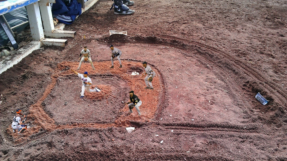
I was digging around in some old photos and came across this. Its a miniature baseball field that I built in the dirt during a baseball game.
I imported this image into photoshop, and then found multiple images of infielders that I could crop and trim to fit into the photo. I imported each photo and used the quick selection tool and the select and mask tool to trim around the players. Copy and paste each player onto the original photo, created a layer mask and used the gradient tool to blend the players into the original photo. I used the clone stamp tool around the edges of the players feet to help blend the shoes into the original image as well. On two of the players I needed to use the free transform tool to adjust the player to feel as though they are facing the direction of home plate. |
|
|
This is a poster I did for work, promoting a monthly competition.
I started with one solid cream colored background, I added the 2 triangles of blue and purple and adjusted the sizes to make a more abstract perspective. I added a third shape, a rectangle and filled in some of the space. I created a square in the center to put the words inside. I used the bevel and emboss, texture layer style to add some character to the center. I centered the font and used drop shadow to create a depth effect. Two fonts were used, as well as the company logo in the bottom left. I found hearts from an image on adobe stock. I copied multiples of the hearts and placed them around the rectangle, changing size and angles. I added a drop shadow to add depth and placed some on top of the square and some below. I used the bevel and emboss layer style to create a more rounded heart and then a layer mask on all of them to place the image of the candy hearts inside of them. |

|
|
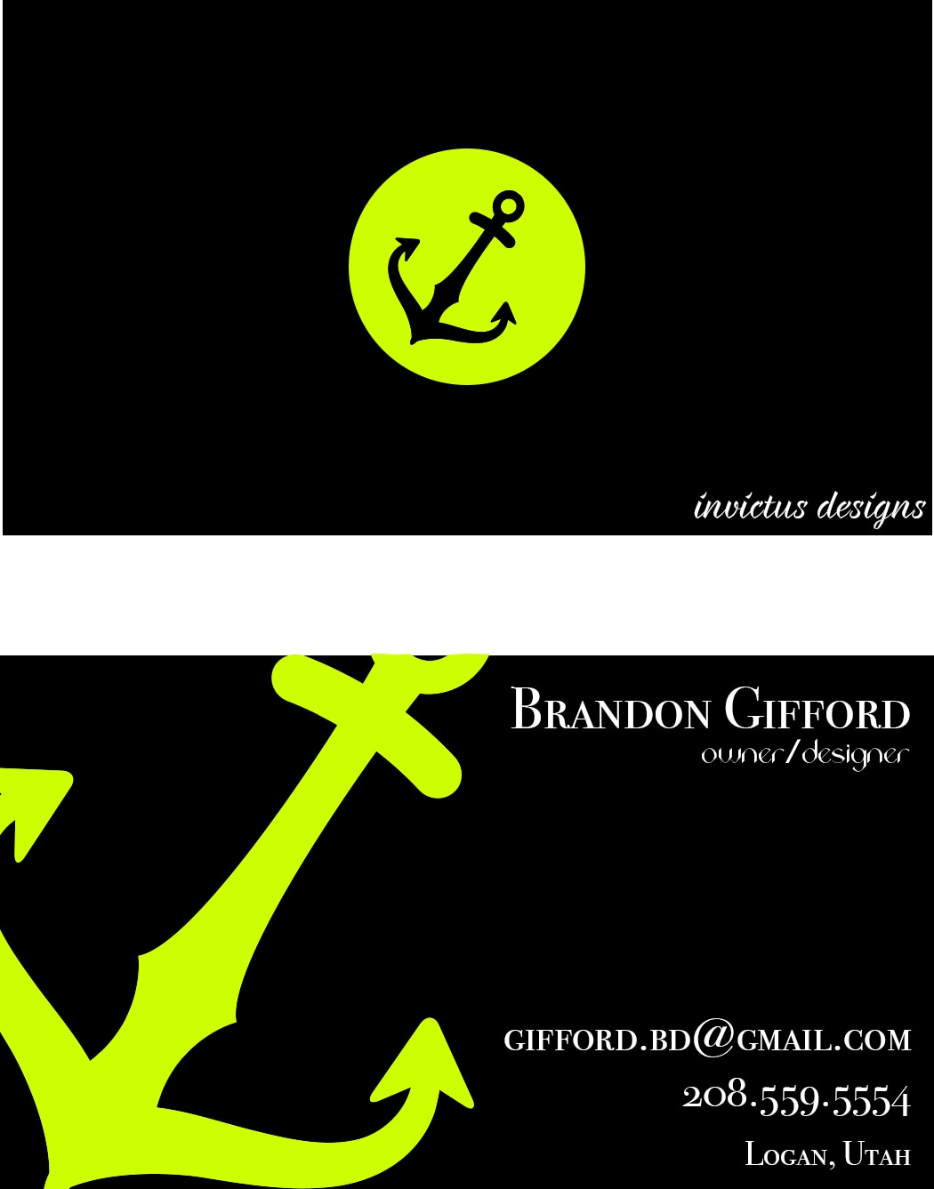
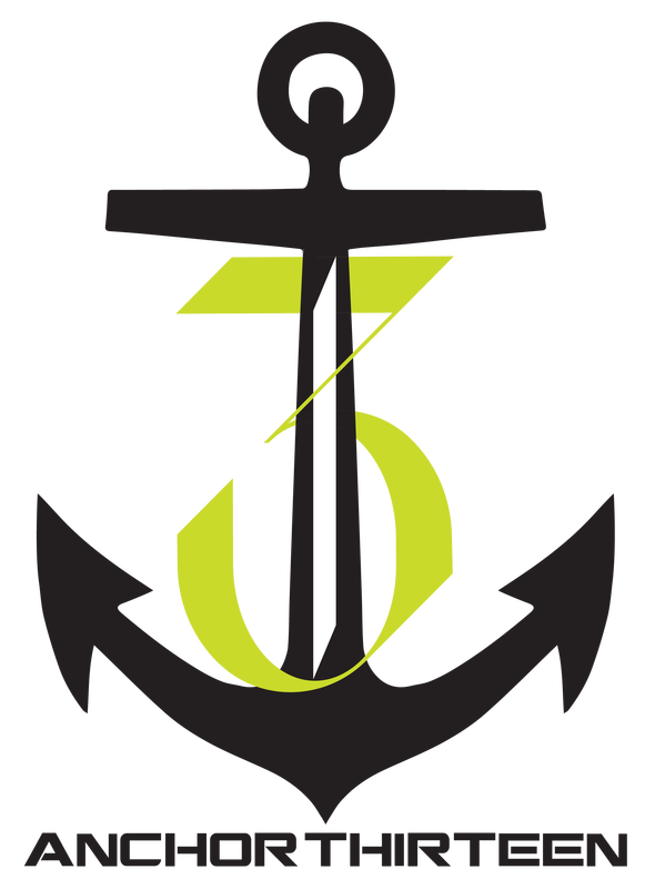
A potential business card design that is simple and clean with some bright colors to pop!
I wanted to keep the design of this card as basic as possible to make sure the main purpose of the business card didn't go unseen i.e name and contact information. I went with black and white and my personal favorite lime green to add some good contrast to the card. On the back of the card is a simple ellipse with the company logo, an anchor that I found on www.sellfy.com with the company name in script on the bottom right. On the front of the card I took that same anchor logo and enlarged it enough so it was flowing off the card this is good repetition but enlarging the anchor helps it to not look too similar. The text is simple and aligned to the right. I used two different fonts Bodoni 72 for the name, email, number and location, Acute regular for the title. |
|
|
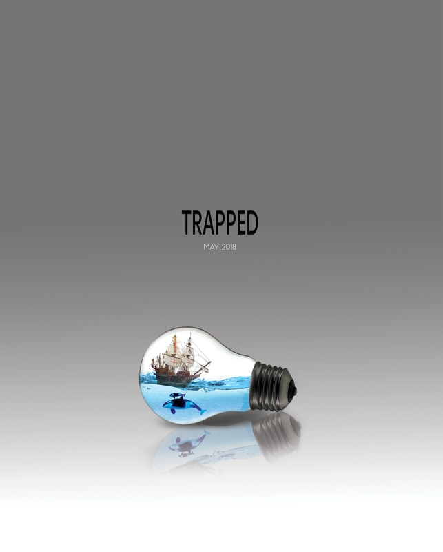
This was a fun movie poster! I took 5 different images and through layer masks and clipping masks was able to come up with this graphic. First, I inserted the light bulb and transformed it to the size and layout I wanted. I used the select tool and selected just the glass portion and copied it on a new layer. This layer is what I used when making clipping masks in the other layers. The next image was the primary water image, using the multiply blending mode and clipping mask, I was able to insert this photo of the water into the bulb. I then created a layer mask and using a very soft brush, I lighted up the edges around the edge of the bulb to make the water flow a little better within the bulb. I then inserted my secondary water image, this is what gave the water its shimmer. By following the same steps as I did in the previous image, multiply blend mode and clipping mask this image was inserted into the bulb. I then dropped the opacity down to 30% on this image so that it wasn't too overpowering. The next image was the ship, this was a simple one and with the clipping mask and multiply blend mode it fit perfectly into my design. I did need to transform this image slightly to get it to look like it was riding the waves just right. Lastly was the image of the whales, on this image after following the clipping mask and blend mode steps I added a layer mask so that I could bring up the brightness and contrast on the whales specifically. I then used the CMND+OPTION+SHIFT+E duplicate tool to duplicate the image, flip it and drop the opacity to make it look like a reflection. Using a layer mask I again used a soft edge brush to soften up the edges and make the reflection disappear. I added a blank layer and used the gradient tool to make the background and then picked two fonts Petala Pro for the title and Panama for the release date.
|
|
|
|
I used camera raw to fix the haze and color in this old photo. I didn't want to go too overboard on the photo so that it would keep its original old time look but still have good color and fix the blown out hazy look. I opened up camera raw and did the auto adjustment initially to get me on the right path. I then continued to adjust the exposure and contrast to bring down the hot look on the lower half. I increased the luminance under the detail tab to help reduce the grainy look in the skin. Under the HSL/Grayscale tab I boosted the greens and blues and dropped the yellows to add some vibrance to the photo.
|
|
|
|
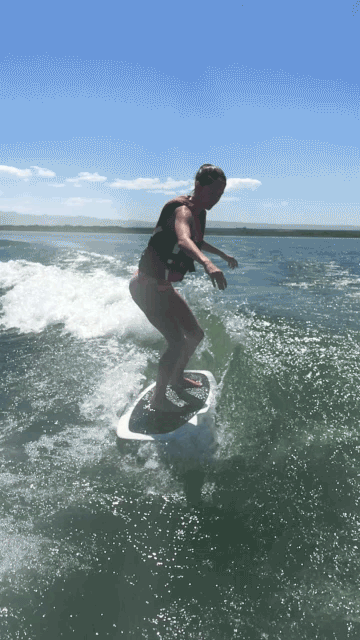
Using a .gif in photoshop was a fun project to learn! I have always liked the moving water combined in a still photo. It was challenging edit due to all the movement of the surfer and the water. Combining those two challenges it took some time and a lot of redoing.
|
|
|
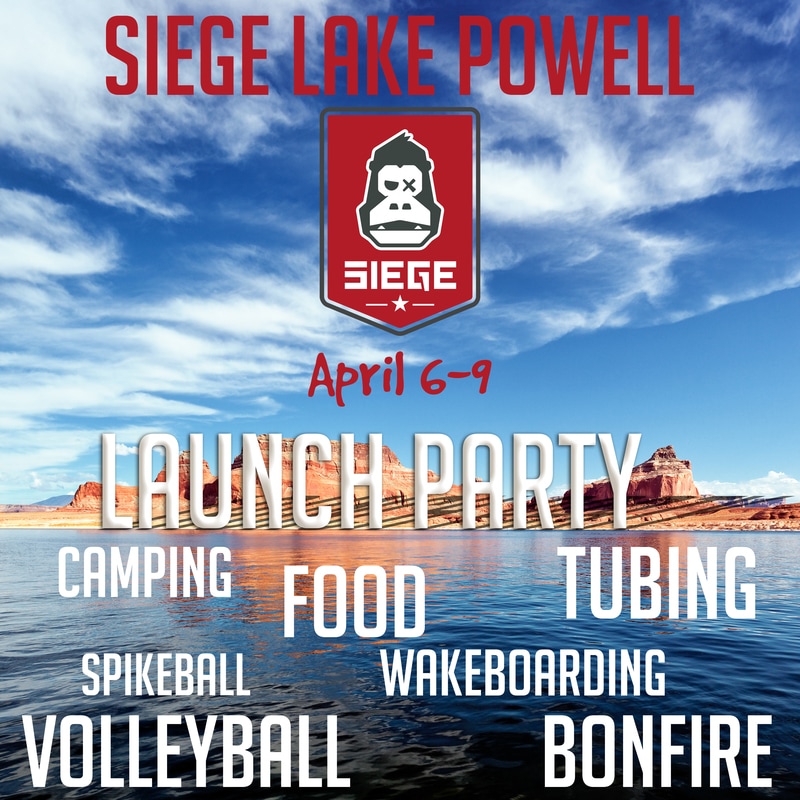
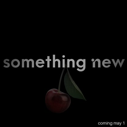
This was a promotional ad I did for work. Subtlety and dark colors to stay mysterious. Using layer masks and gradients to cause the fade effects, with brushes to touch up the edges.
|
|
|
These are just two examples of logo design I have done for clients. Using photoshop and illustrator.
|
  |
